AI-SaaS
Contract
2 Weeks
Sole Designer
Knownwell

OVERVIEW
I designed an AI-SaaS application for Knownwell, a platform that helps B2B services firms track the health of their client relationships. As the sole UX/UI designer, I developed a clickable prototype and high-fidelity screens to give anyone responsible for managing client accounts a clear, real-time view of their entire portfolio, so they could walk into every meeting ready to act, not just report.
TYPE
Contract
WHAT
AI-SaaS
DURATION
2 Weeks
TOOLS
Figma, FigJam
ROLE
Lead Product Designer
TEAM
CEO, CMO, CTO, PM
PROBLEM
Teams had no reliable way to know which clients were at risk, which were thriving, or where to focus next.
Data lived across multiple systems, updates were manual, and decisions came down to gut feel rather than real intelligence.
RESEARCH
Working from the research the Knownwell team had already conducted, I synthesized the findings into six core pain points that grounded every design decision I made throughout the project.
Unreliable Data
Manual updates lead to inconsistent and inaccurate information
Inefficient Meetings
Time is wasted clarifying data instead of making strategic decisions
“
Time - Consuming
Manual processes are slow and resource intensive
Subjective Inputs
Data is based on personal opinions rather than objective metrics, reducing its reliability
Lack of Confidence
Low trust in data undermines decision-making
Limited Insights
No real-time, unbiased insights hinder quick, informed decisions
Meetings turn into data scrambles rather than strategy sessions, wasting time and focus.
When data is uncertain, decision-making becomes guesswork, and confidence in outcome fades.
“
USER PERSONA
To ground every decision in a real human need, I defined the primary user: someone responsible for managing a large client portfolio, preparing for regular status meetings with incomplete and unreliable data. Their core need was simple. Walk into every meeting knowing exactly which clients need attention and why, without spending hours manually pulling that information together.
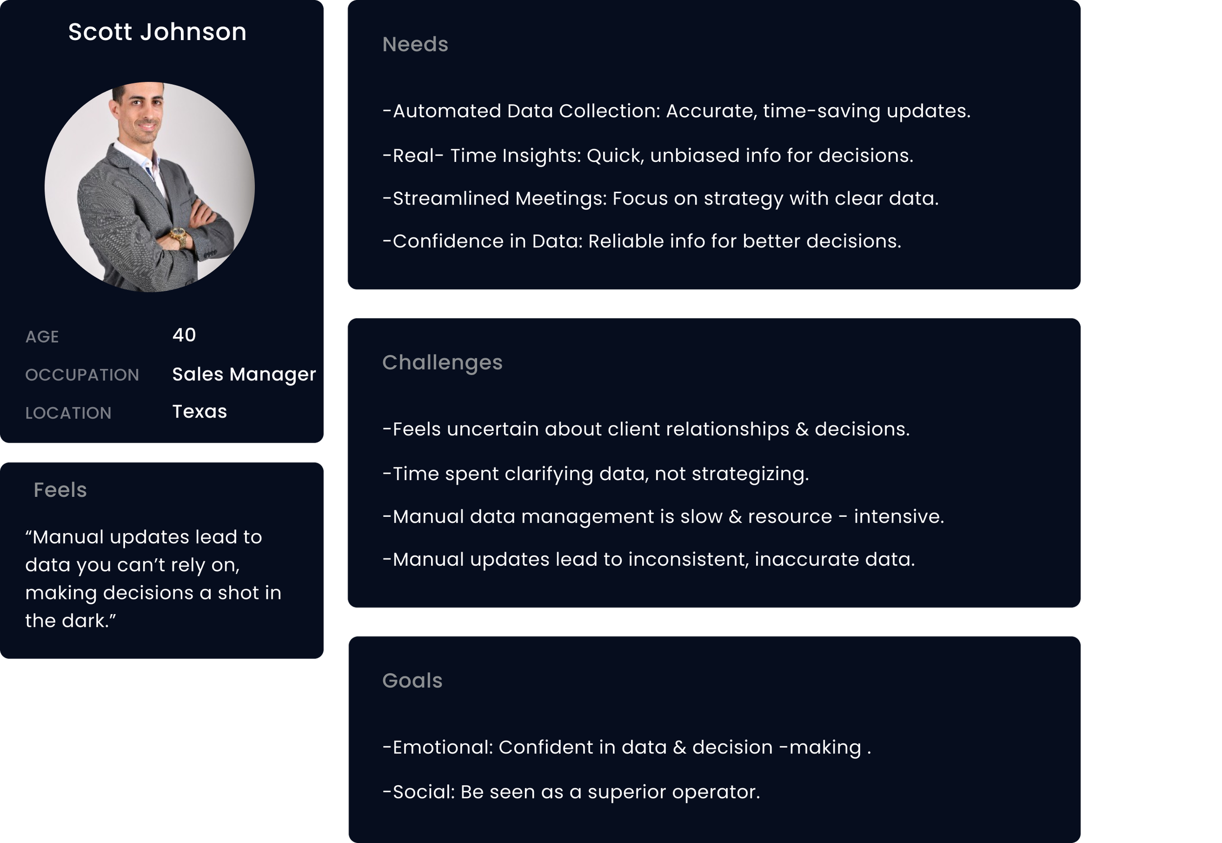
The business goal is to leverage AI to enhance data accuracy and streamline meetings, there by improving strategic decision-making and overall efficiency.
A product that puts the right information in front of the right person at the right moment, so no client slips through the cracks and no meeting is wasted on data clarification again
BUSINESS GOAL
OUTCOME
IDEATION
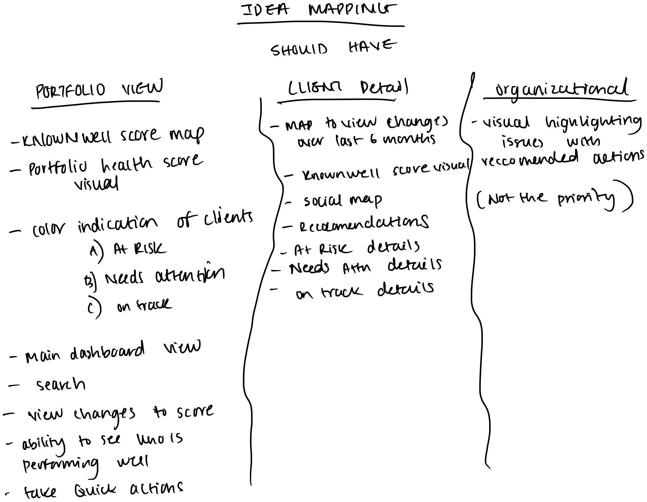
I collaborated with the product manager to define the core features needed for launch. From those discussions I began sketching ideas and mapping out the user flow.
USER JOURNEY
To map out the core user journey, I created a flow showing how a user would navigate through the product from dashboard to action.

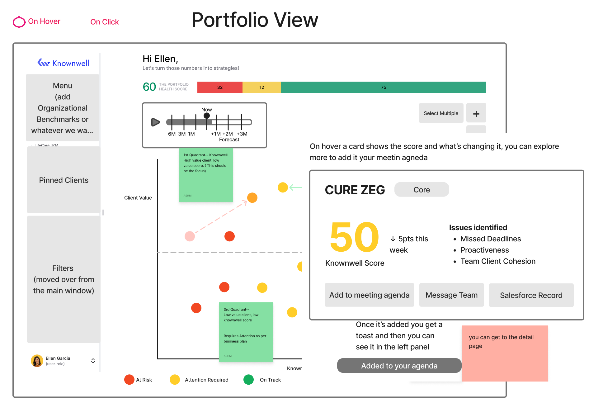
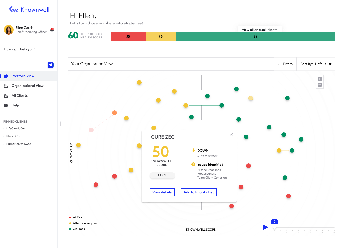
Hovering over a client data point reveals a card showing their current score and what is driving the change. From there, the user can explore further or add the client directly to their meeting agenda.
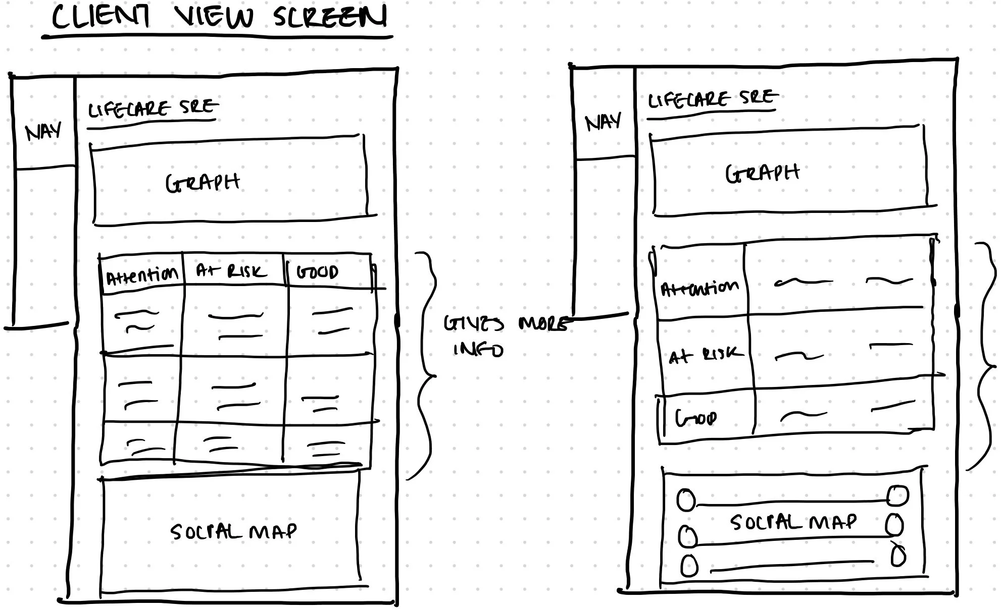
The Client Detail screen surfaces specific account information and highlights exactly what needs attention, so the user can take action without digging for context.
Before moving into final designs, I built a clickable prototype to test the flow end to end. This gave the client something tangible to react to and allowed us to align on structure before moving into high-fidelity design.
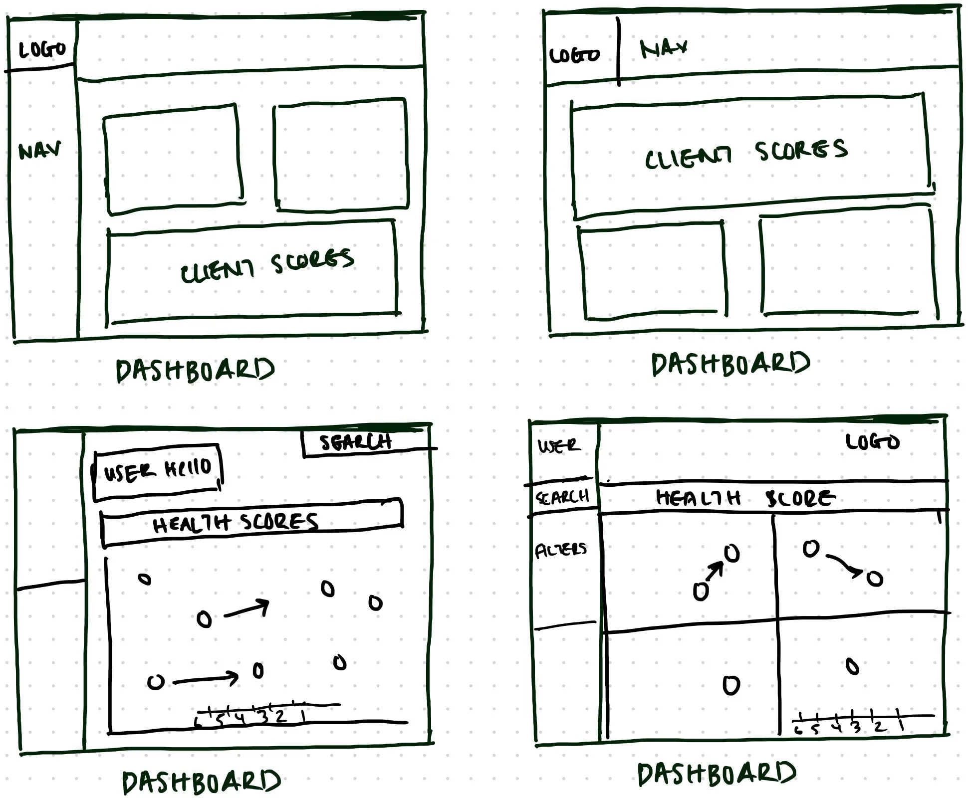
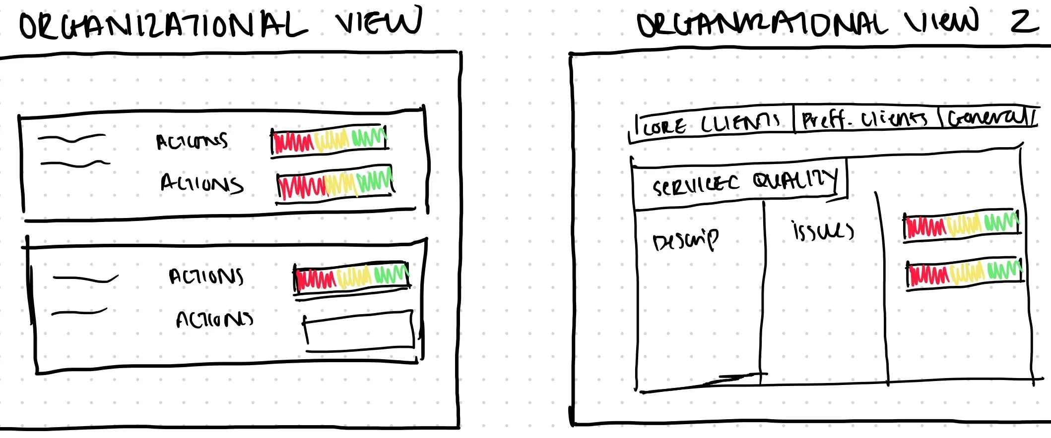
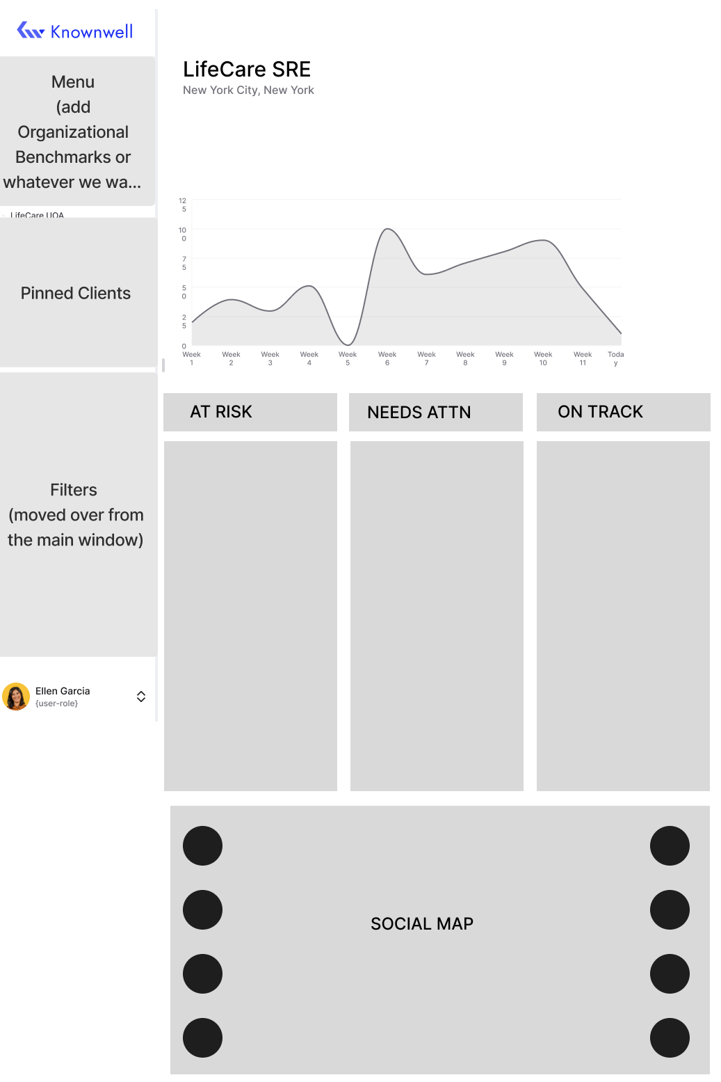
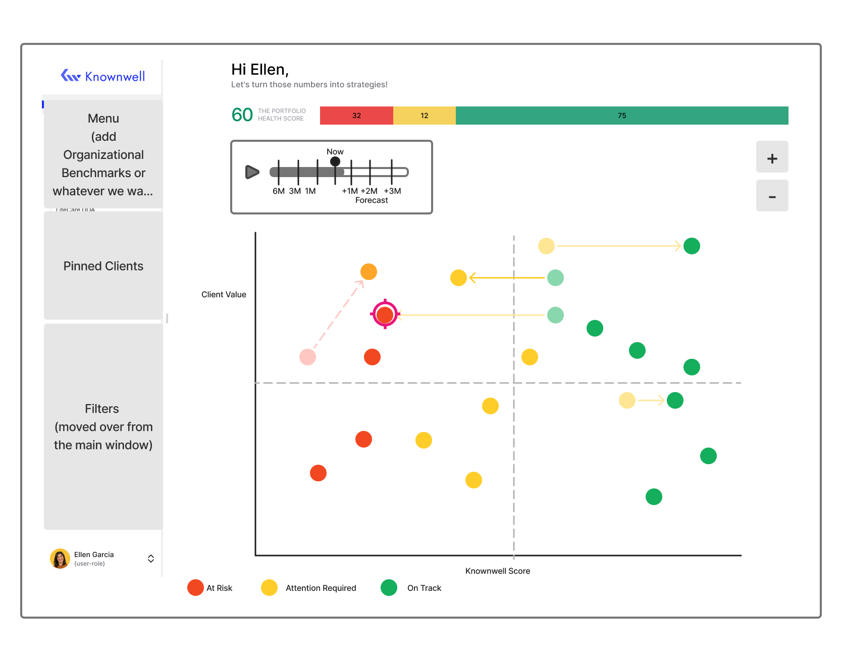
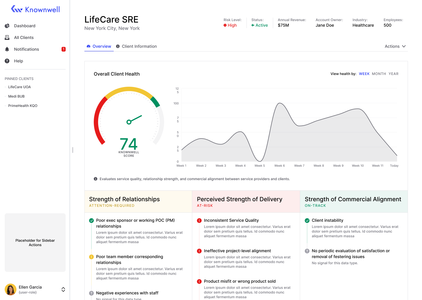
INITIAL WIREFRAMES
These early wireframes were about validating direction, not polish. I focused on the core layouts: Portfolio View, Client Detail, and Organizational View. The goal at this stage was to get the structure in front of the client quickly so we could align on what the product actually needed to do before investing time in high-fidelity design.
Screens below show: Portfolio View, Client Detail, and Organizational View.
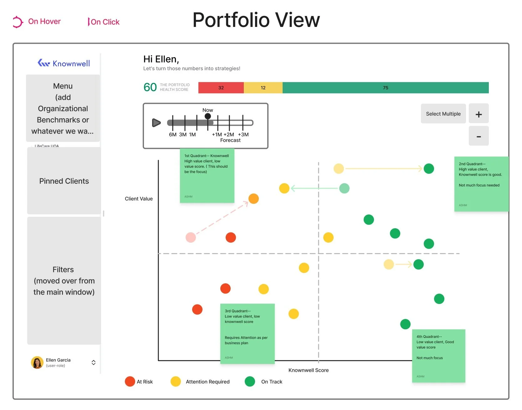
The Portfolio View gives users a visual overview of all clients and their performance over time. The timeline allows them to track how each client has been doing over the past six months.
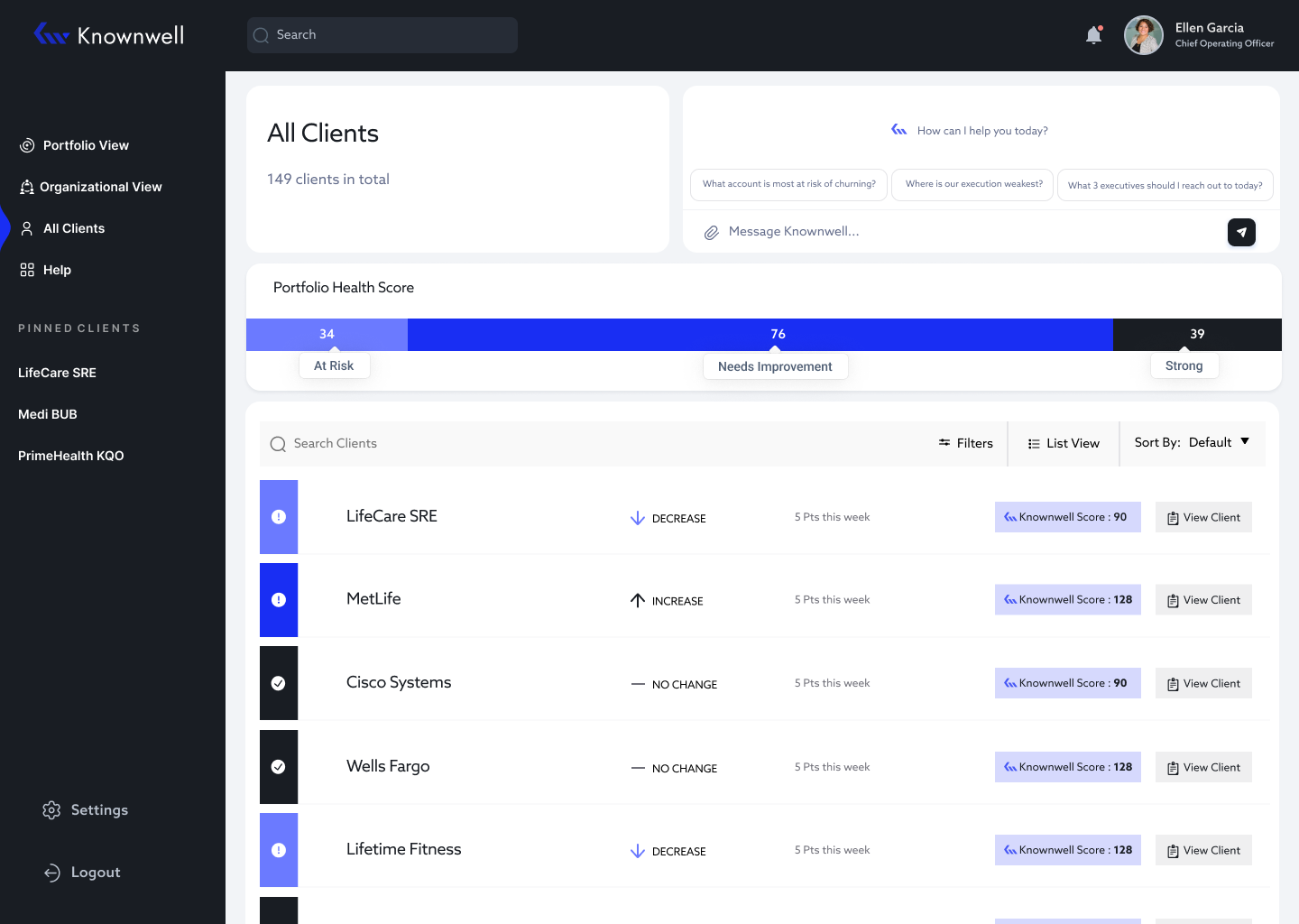
The All Clients screen gives users a complete list of every client, their current performance score, and any changes over time.
MID- FIDELITY CLICKABLE PROTOTYPE
FEEDBACK
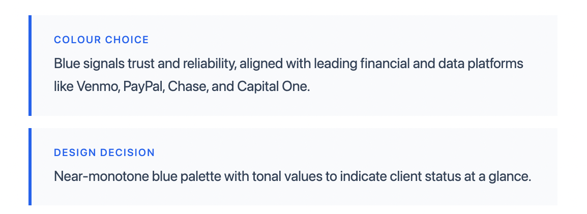
This was the feedback I received from the team. They also requested a UI overhaul, describing the direction as "Modern, Wow, AI feeling." I researched design trends and colour theory to translate that brief into something tangible, landing on a minimal, near-monotone blue palette.
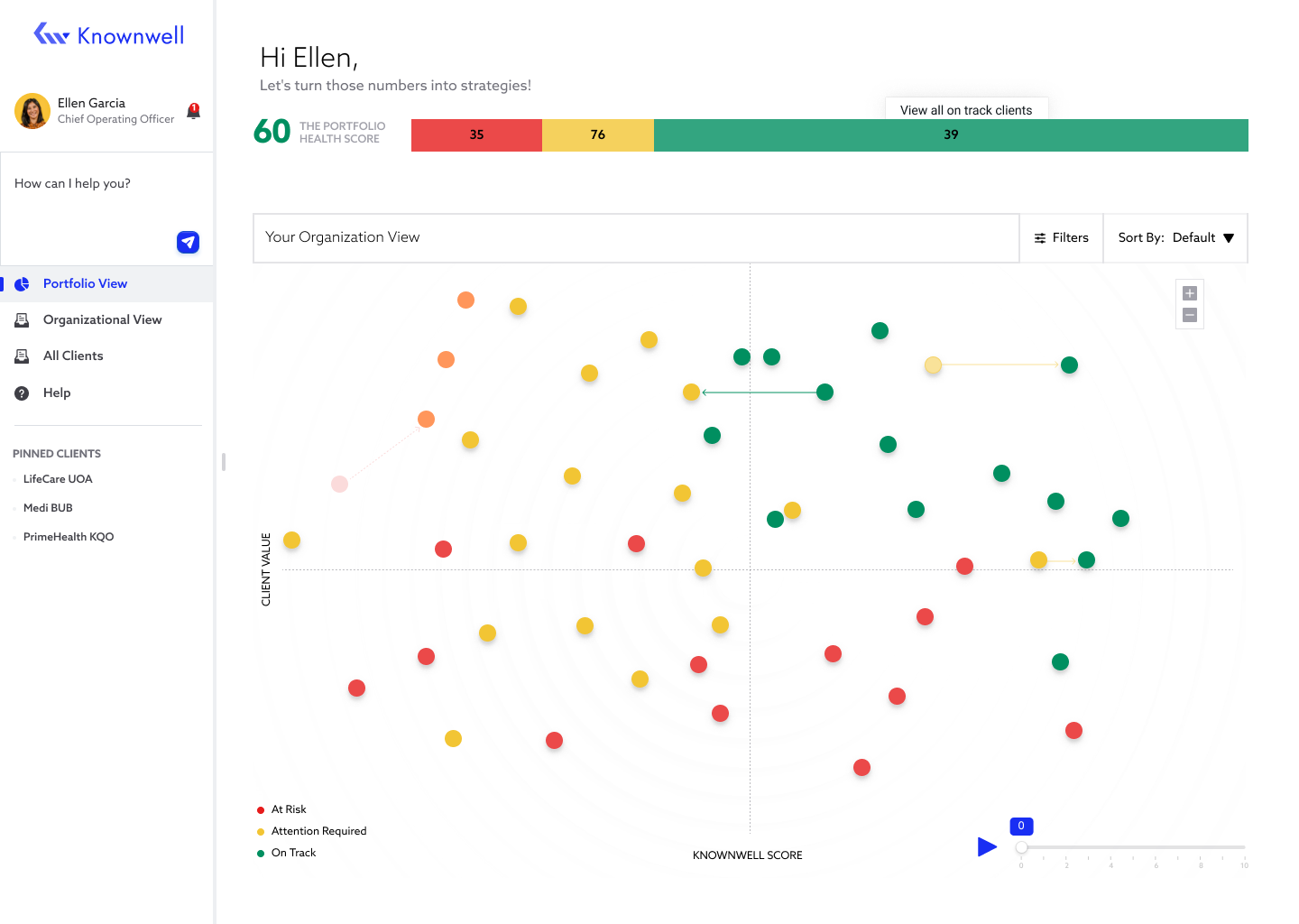
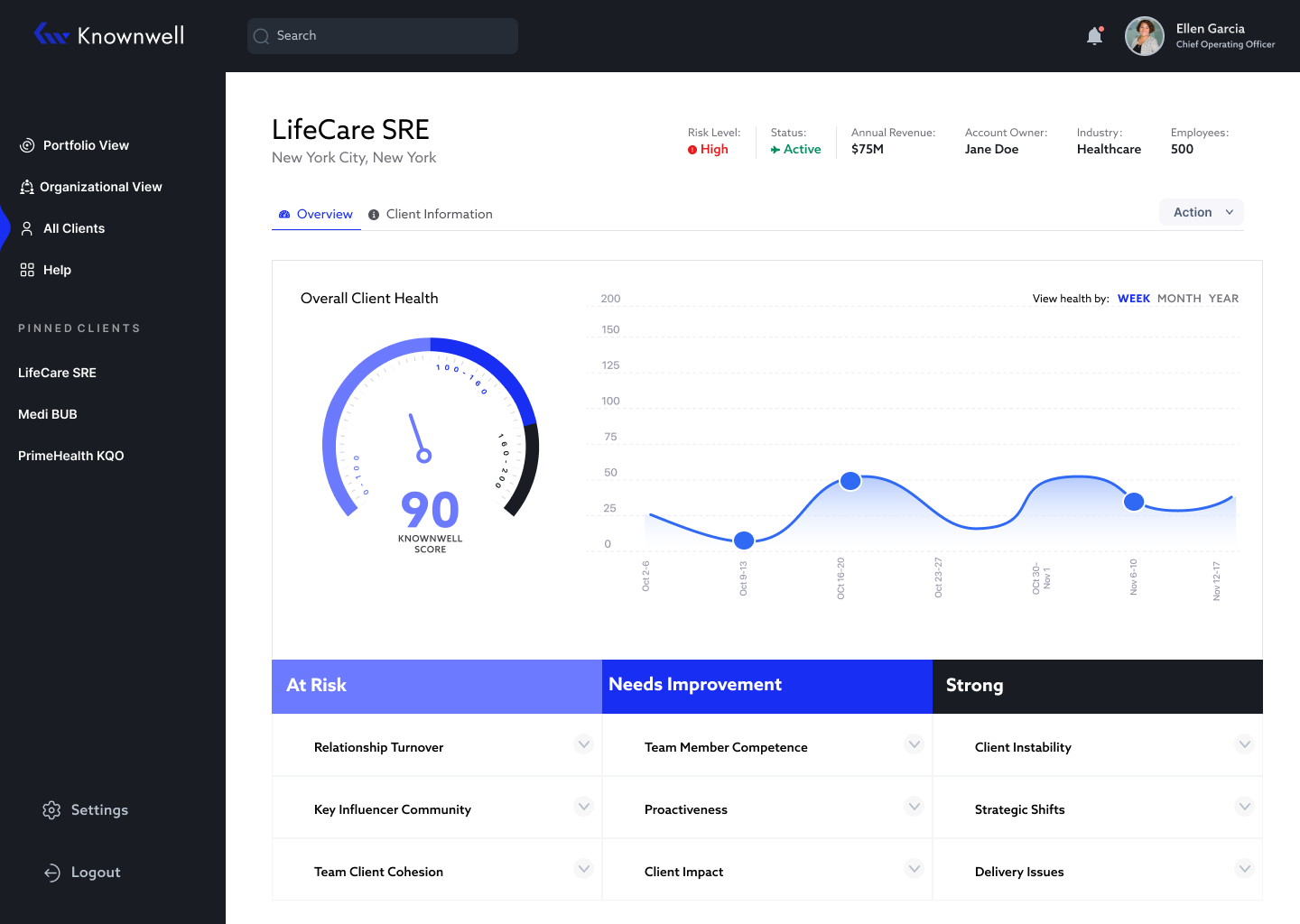
FINAL DESIGNS
I implemented the team's feedback into the final designs, overhauling the UI and design system. The screens below show the before and after.
BEFORE
Additional views for detail screen: Card/List View
AFTER

MAIN CHANGES / DESIGN SYSTEM
The rebrand called for a more modern, sleek aesthetic that aligned with Knownwell's identity. I moved away from the traditional red, yellow, green status indicators which felt outdated and off-brand, and introduced a blue-toned colour system that better communicated the AI-forward nature of the product.
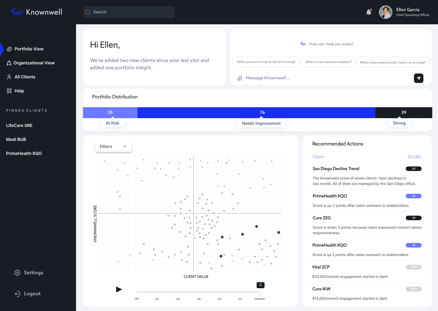
FINAL PROTOTYPE
The final prototype delivered to the client covers four core flows: Portfolio View, All Clients Screen, Client Detail Screen, and Search.
Figma File Here
USER TESTING FEEDBACK
The prototype was presented at launch and tested with 50 participants. Overall feedback was positive, with users finding the interface intuitive and easy to navigate. The portfolio visualization and recommended actions section were particularly well received, with participants appreciating having clear next steps surfaced for them directly in the product.
REFLECTION/ CHALLENGES