ED-Tech
Consulting
UX Design
UX Research
NYC DOE
OVERVIEW
As Product Designer at Zenda, I owned the redesign of 6 key modules within the NYC Department of Education's Special Education Data Management System (SEDMS). Working alongside a wider design team, UX researcher, engineers and subject matter experts, I drove the end-to-end design process for my modules, from user research and co-design sessions through to high-fidelity prototypes and usability testing, with the goal of creating a more reliable, intuitive system for educators and administrators.
WHAT
Data Management System
DURATION
May - Aug
TOOLS
Figma, Miro
ROLE
Lead Product Designer
Despite costing over $130 million to build, SESIS malfunctioned up to 800,000 times a day, making it nearly impossible to track whether students with disabilities were receiving the services they were legally entitled to. The failures resulted in millions of dollars in legal settlements.
PROBLEM
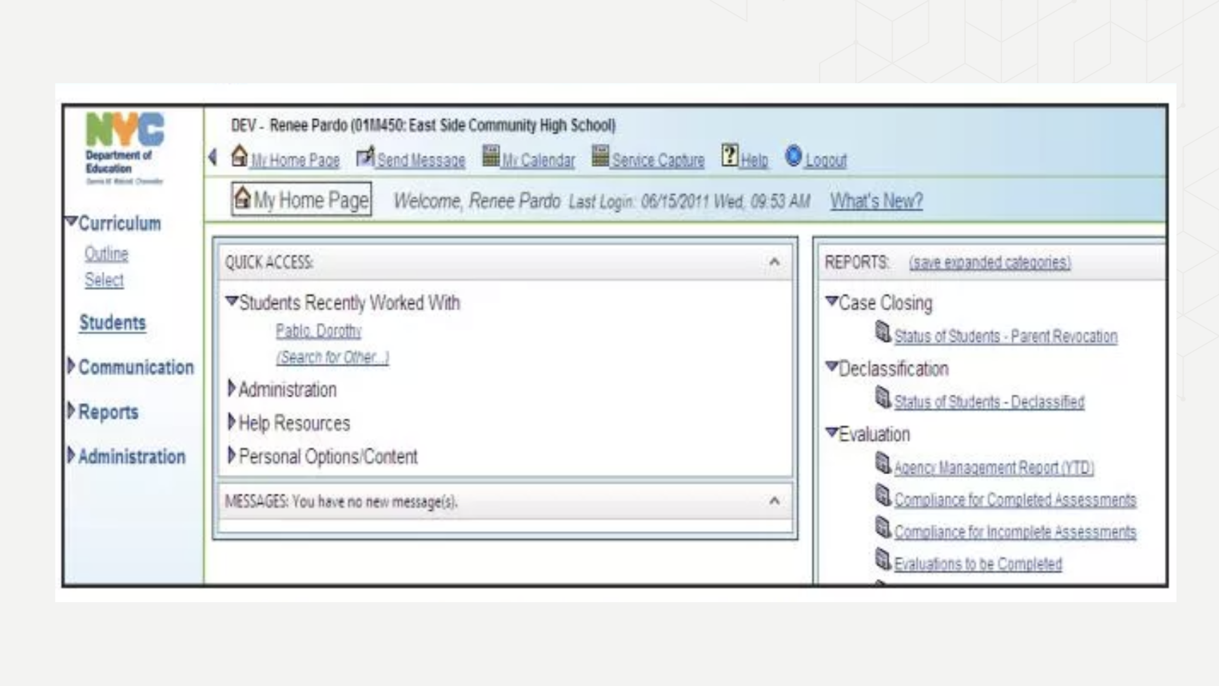
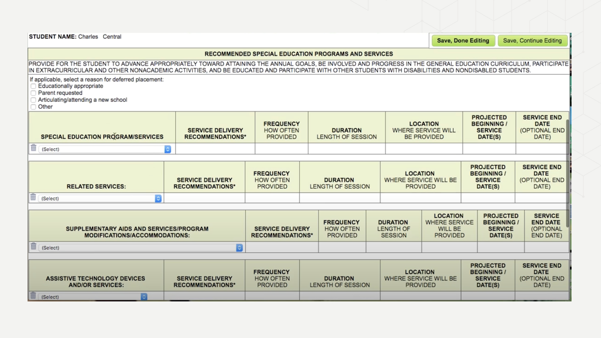
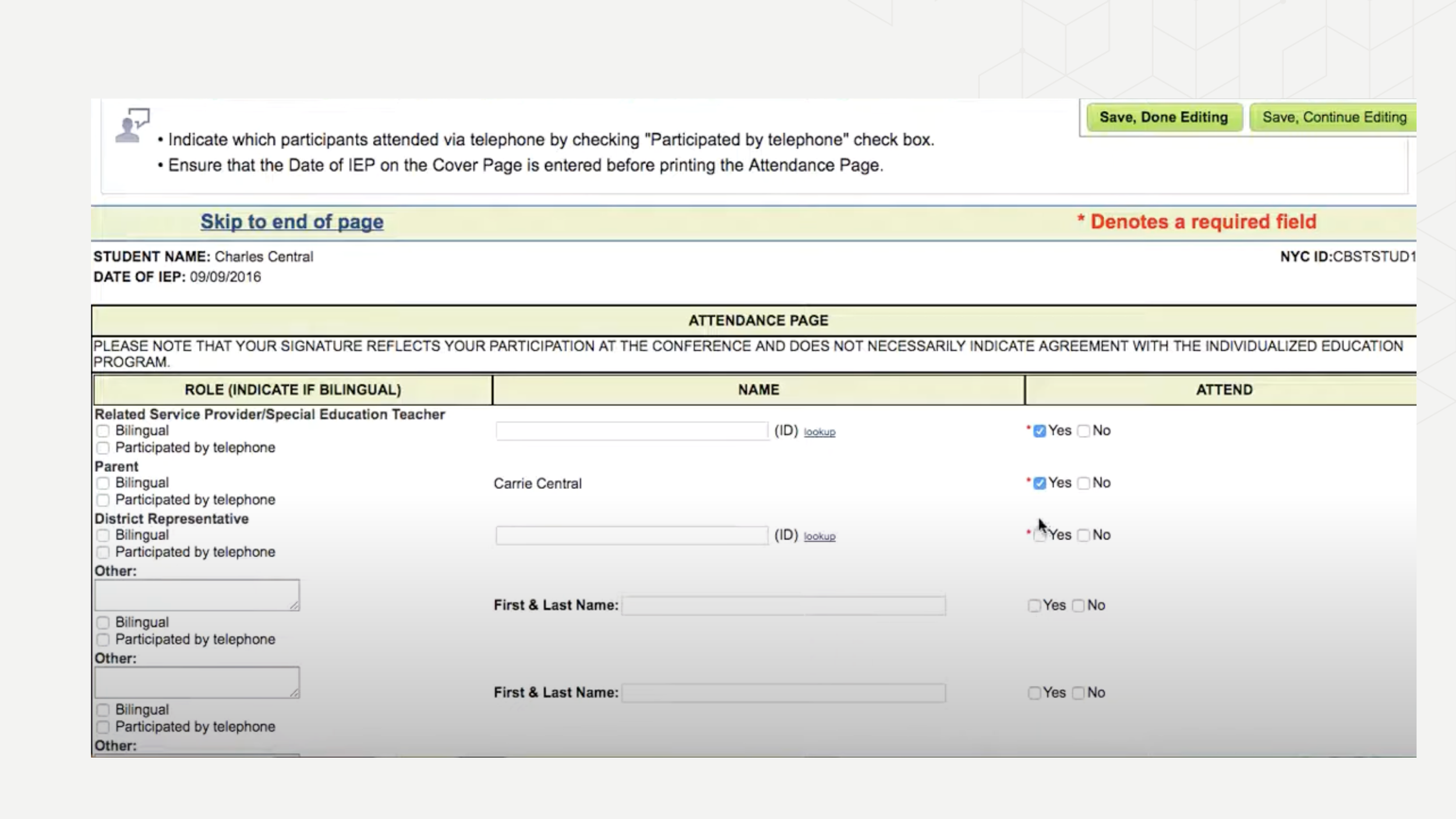
CURRENT STATE OF SESIS
The screenshots below show the current state of the system prior to the redesign
SYSTEM COST
$130 M +
DAILY MALFUNCTIONS
800,000
LEGAL SETTLEMENTS
$ M +
PROCESS
To ensure a shared understanding of the system's complexities and compliance requirements, everyone on the project team, including stakeholders, was required to participate in the research process.
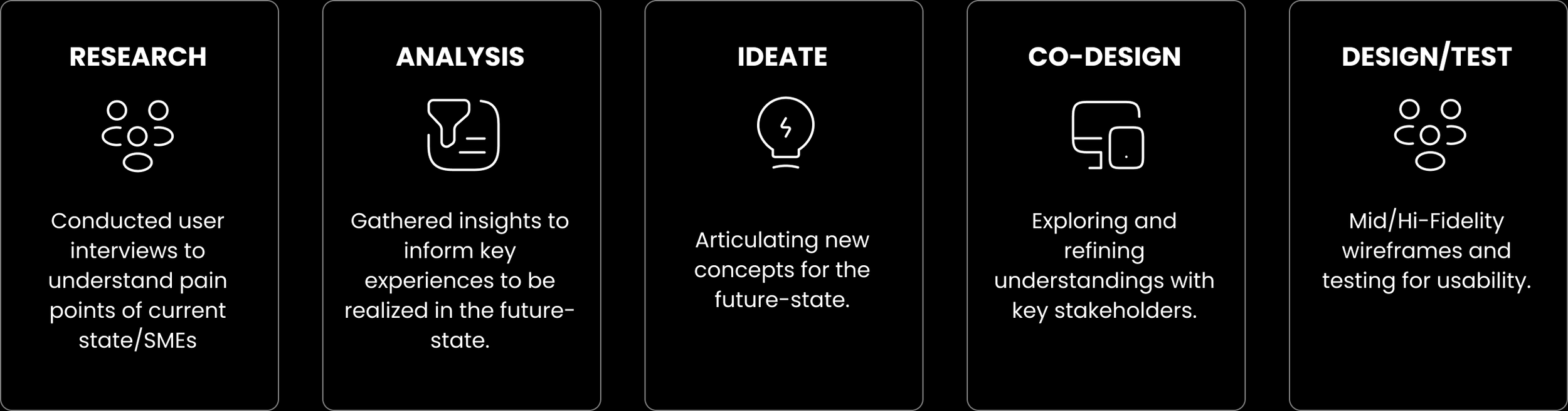
Taking a blue sky approach in designing the new system while ensuring we didn't overlook the needs of existing users, gradually easing them into the future state."
BUSINESS GOALS
Reduce system malfunctions and improve overall reliability
Ensure accurate tracking of services for students with disabilities.
Minimize costly legal settlements caused by system failures.
Enhance operational efficiency for educators and administrators
SOLUTION
Design SEDMS (Special Education Data Management System) from the ground up, a reliable, intuitive platform that ensures every student with a disability receives the services they are legally entitled to.
CHALLENGE
RESEARCH
Research included user interviews with teachers, case managers, school psychologists and related staff to understand their day-to-day experiences with the current system.
Additional research methods included:
Participated in weekly bootcamp sessions to get familiar with the current state of the Special Education Student Information System (SESIS).
Conducted heuristic evaluation of the current state of SEDMS to identify usability issues.
Held weekly meetings with Subject Matter Experts (SMEs) to learn the system and address any queries.
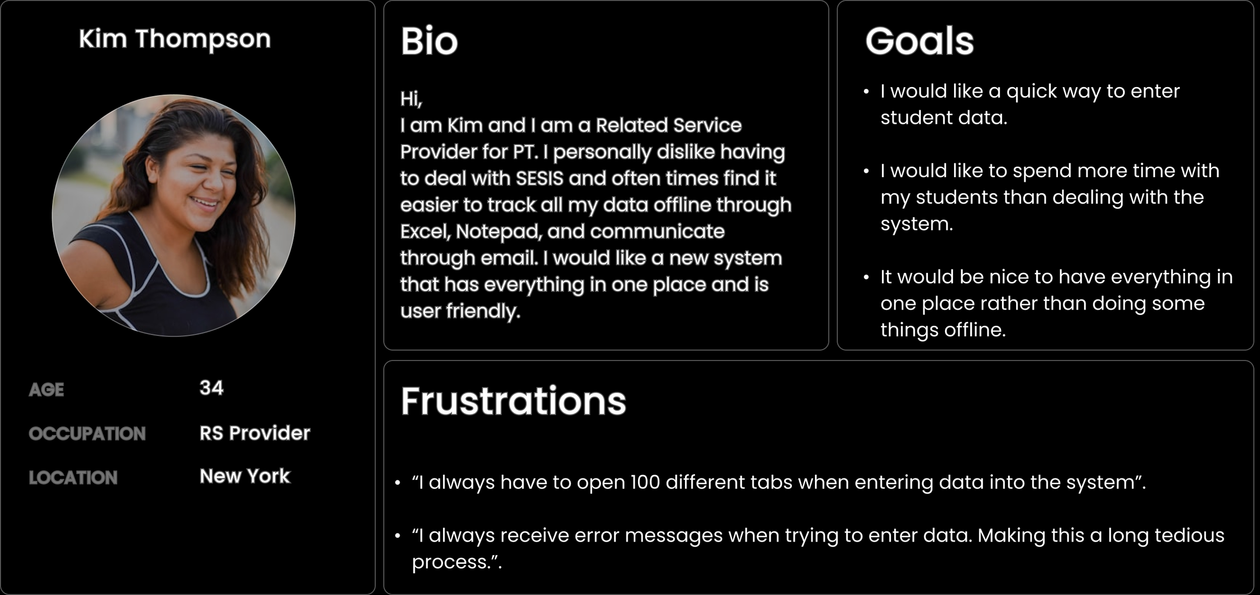
USER PERSONA
To ground design decisions in real user needs, I developed a persona based on a Related Service Provider and their experience navigating SEDMS.
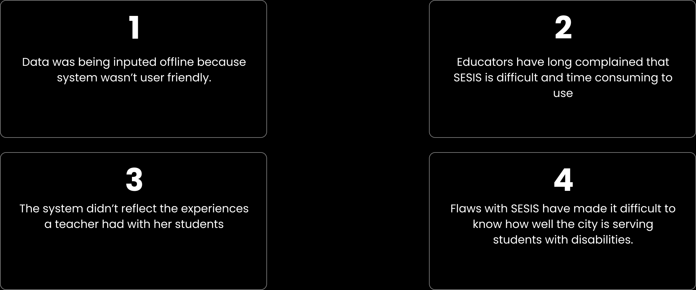
PAIN POINTS
Four key pain points emerged consistently across all user groups, forming the foundation of every design decision made throughout the project
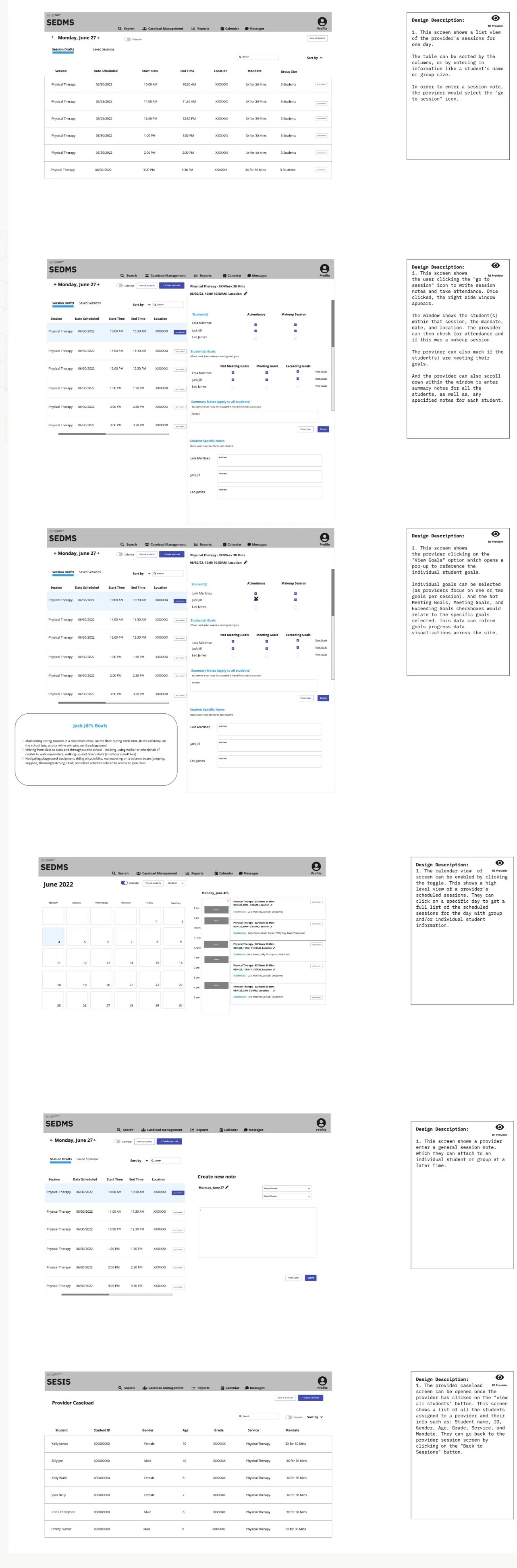
IDEATION/ LOW-FI WIREFRAMES
The wireframes below focus on the Related Service Provider experience, covering how providers view and enter session notes for students in their caseload, with access to the Student Progress Dashboard and Caseload Overview screens. These were presented to stakeholders during weekly co-design sessions to gather feedback and validate the design direction.
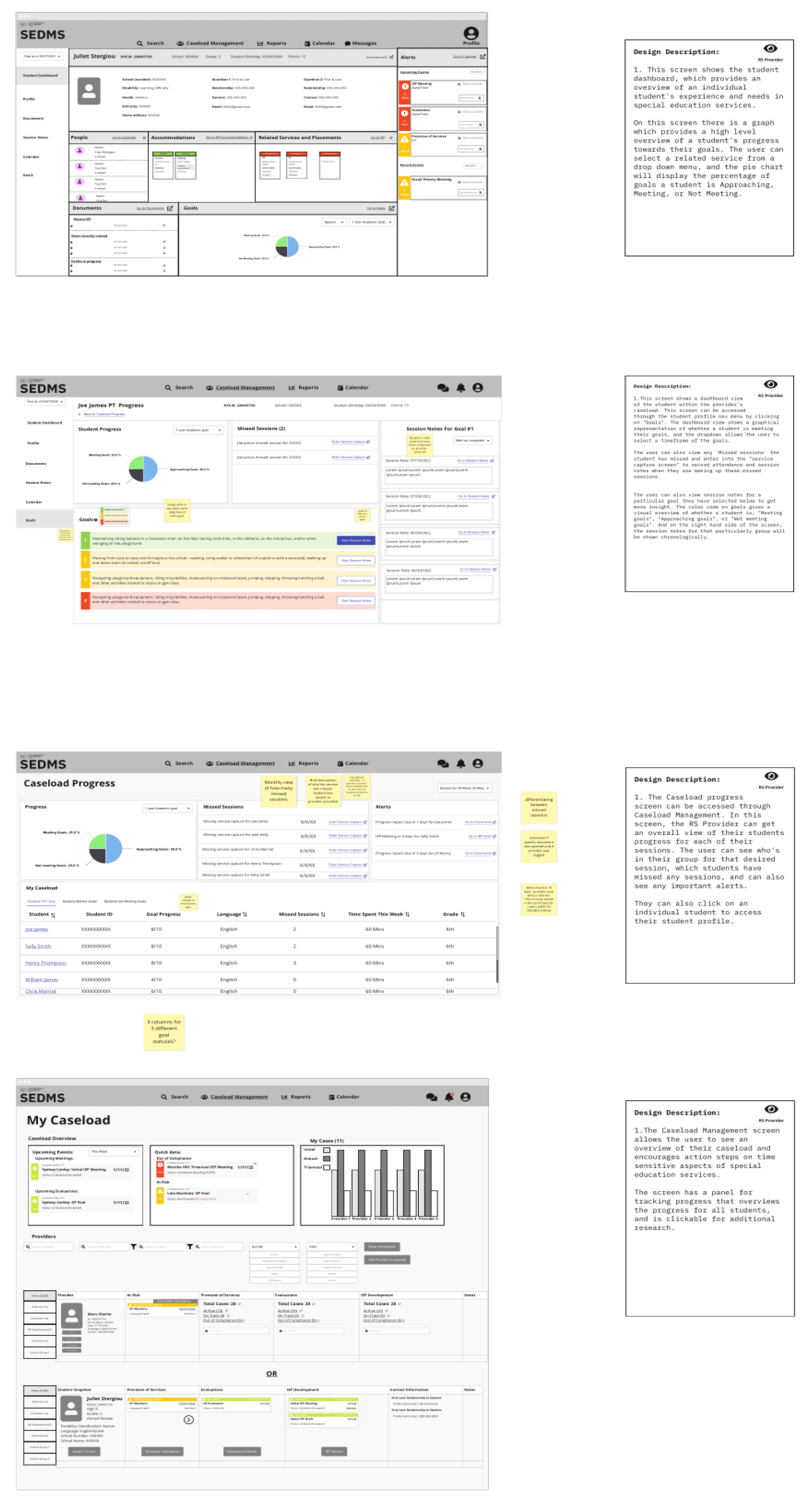
CO-DESIGN SESSION FEEDBACK
Weekly co-design sessions with stakeholders and users provided valuable insights into the low-fidelity wireframes, validating our design direction. Feedback from SMEs, users and the development team was overwhelmingly positive, giving us the confidence to progress to high-fidelity designs.
HIGH - FIDELITY DESIGNS/PROTOTYPE
DESIGN SYSTEM
USABILITY TEST FEEDBACK
I conducted usability testing on the prototype with providers, case managers and teachers. Key findings included
As part of the redesign, we established a new design system from the ground up. I was heavily involved in defining the components, patterns and visual guidelines to ensure consistency across the six modules I owned. Accessibility was a key consideration throughout, so everything was designed in line with WCAG standards given the diverse range of users we were designing for.
They found the experience intuitive and straightforward, noting that it was 'easy to learn,' even for new users.
Certain text should remain non-editable for the user to comply with IEP requirements.
They were especially impressed with the ability to access IEP goals through a dropdown menu, which made the information more easily accessible and streamlined their workflow.
USABILITY TEST FEEDBACK FOR STUDENT PROGRESS DASHBOARD & CASELOAD SCREENS
All participants appreciated the color-coded 'goals' on student progress, which made it easier to identify key information at a glance.
Participants were enthusiastic about the concept of a dashboard for viewing student progress and particularly enjoyed the visuals.
Everyone appreciated having direct links to student progress, allowing them to jump directly to the relevant section.
DEVELOPMENT
Following the completion of high-fidelity designs and usability testing, the product moved into development. I worked closely with the engineering team to ensure designs were clearly documented and specs were easy to follow, staying available throughout the build to answer questions and adapt designs where needed. The system was in active development at the time of my departure.
TAKEWAYS
My key takeaway from this project is the importance of thorough research and ongoing collaboration with cross-functional teams to meet deadlines and minimize confusion. It also highlights the value of maintaining a user-centered design approach while balancing business requirements.
VIEW OTHER MODULES